How do you design for investors?
As Senior Design Consultant embedded within the Chief Investment Office (CIO), I collaborated with research analysts and economists to present complicated data stories and insights as easy-to-comprehend communications, visualizations, and infographics.
The CIO is responsible for the organization’s investment portfolios. The CIO team synthesizes the best internal and external investment thinking and thought leadership to deliver tactical and strategic portfolio guidance and goals-based advice to the financial advisors and clients of the firm.
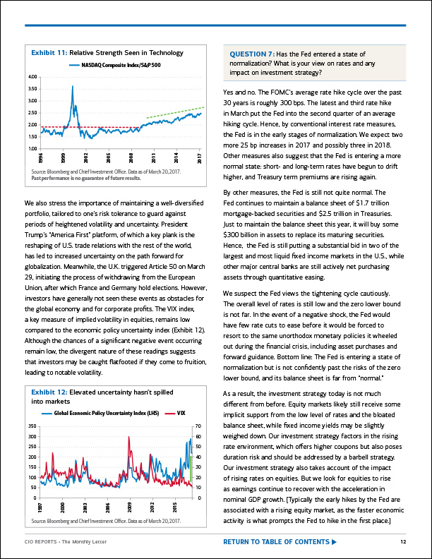
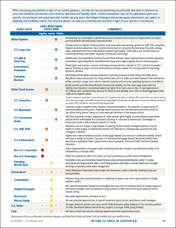
Thought Leadership
CIO Website
I developed, designed, and produced content and integrated resources that provided thought leadership, investment guidance, and portfolio solutions to the firm’s financial advisors and their clients.
User Experience
Strategy Award
Merrill Lynch financial advisors used a proprietary online authoring platform to create customized marketing materials.
As originally designed, the tool was not meeting their needs and they were expressing their frustration.
I was tasked by the marketing team with analyzing and improving the user experience.
By simplifying the existing user flow, streamlining the interface, and expanding the available design template options, overall site use increased between 35 – 50%.
Financial advisors clearly appreciated the effort and so did the Gramercy Institute, which selected our team for a Financial Marketing Strategy Award.
User Flow
Analysis
Our team sought feedback from financial advisors who had been using the online authoring platform. Their input identified several pain points, but primarily the need for a simplified process. Analysis of the existing flow helped identify unnecessary bottlenecks and allowed us to streamline the user flow to just six logical steps.
REQUIREMENTS
User Needs
Advisor input helped identify options that were missing from the existing tool:
- Templates that could accommodate growing teams
- Templates that allowed advisors to list all of their professional designations
- Templates with and without advisor biographies
- Templates with multiple photo options, including larger team and individual photos
I reviewed hundreds of existing printed brochures, flyers, and postcards and asked advisors to share examples of content that the current templates could not accommodate.
By prioritizing the required fields and establishing minimum and maximum character counts for each field, I developed a plan for accommodating and modularizing the content. These newly captured requirements became the road map for the interface and template redesign.
Design System
Modularity
I developed a design system to define how advisors would be represented in their marketing materials. Combining an advisor photo with a content block consisting of fields defined in the requirements document, this “lockup” became the building block for a series of modular templates.
The lockup itself was designed to be variable (number of professional designations, with or without a biography). The appropriate lockup would be automatically triggered by decisions made during the selection process, such as:
- the type of template selected (postcard, flyer, brochure)
- the size of the financial team
- inclusion/exclusion of biographies
Templates
InDesign Templates
Working with the development team, we identified and prioritized new production templates which I built in InDesign. The overall number of template offerings was increased to:
- accommodate teams of varying sizes
- enable financial advisors to list all of their professional designations
- provide multiple photo options per team, including larger team and individual photos
Wireframes
Authoring Tool
Feedback from financial advisors who had been using the platform helped identify pain points, including the request for a more user-friendly interface.
I created low fidelity wireframes to provide suggestions as the digital team considered how best to modify the existing interface.
Data Visualization
Infographics and Charts
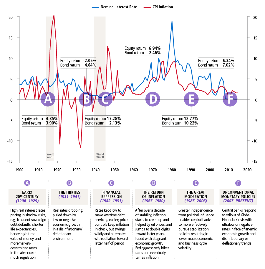
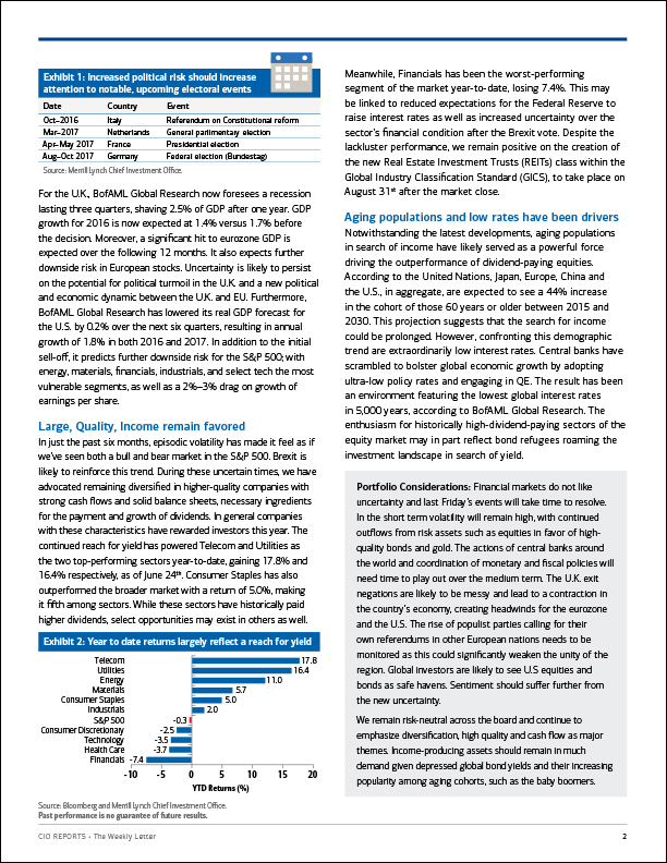
Data visualization is the presentation of complex data in a pictorial or graphical format.
Visualization makes the data more natural for the human mind to comprehend and therefore makes it easier to identify trends, patterns, and outliers within large data sets.
My job included conveying complex concepts in a universal manner that business leaders and their clients could understand and utilize.
Workflow
Publishing
I helped Merrill Lynch define their content publishing workflow—from draft to review to posting—by:
- managing branding standardization across all disciplines
- conducting content and design audits to ensure conformity with established design guidelines and QA standards
- evaluating and optimizing design processes, resulting in time and resource savings
- creating user-friendly production templates, style guides, reference materials, and training documentation to share best practices, standards, and guidelines with team members
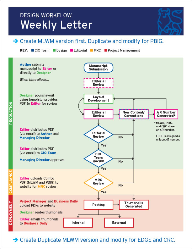
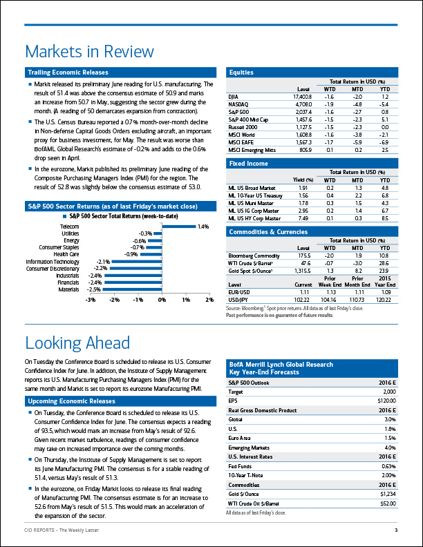
Weekly Letter
Publishing
I developed, designed, and produced The Weekly Letter, the CIO team’s latest perspectives on the markets and global economy.
Each report included:
- commentary on market trends
- releases of economic data
- a summary of the past week’s market activity
- data on performance of key indexes
Monthly Letter
Publishing
I developed, designed, and produced The Monthly Letter, the CIO team’s look at longer-term forces shaping market opportunities.
Each report included:
- a deeper dive into longer-term financial market trends
- an in-depth interview with a leading market strategist
- a summary of asset class positions