How do you design for vision deficiency?
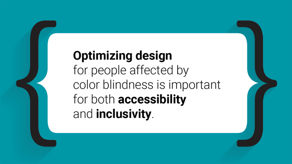
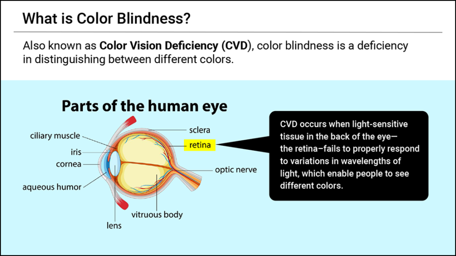
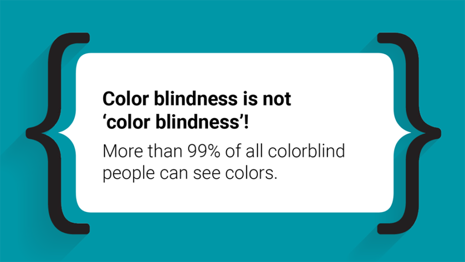
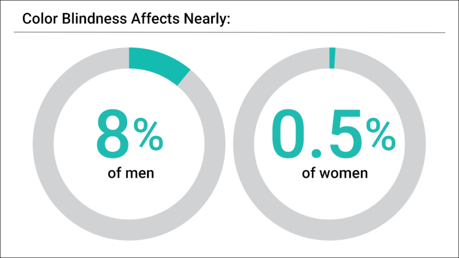
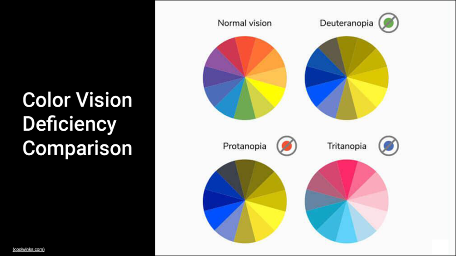
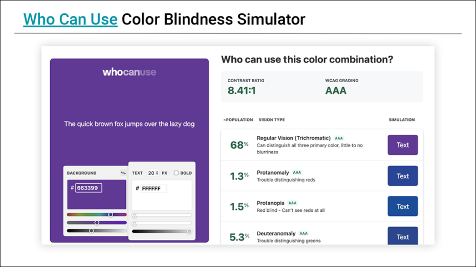
Also known as Color Vision Deficiency (CVD), color blindness is a deficiency in distinguishing between different colors that affects nearly 8% of men and 0.5% of women. Optimizing design for people affected by color blindness is important for both accessibility and inclusivity.
Designing accessible solutions for people with CVD doesn’t mean you have to forgo color entirely. You just need to be a bit more intentional with how you use color.
My role:
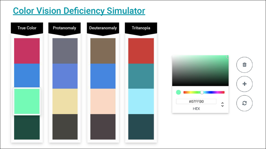
I researched and created internal documentation to build the 2U design team’s CVD awareness. Designers were encouraged to install web browser extensions that simulated CVD so they could design with color blindness in mind. Together, we discussed industry best practices including:
- don’t rely on color alone
- use icons and symbols
- use textures and patterns
- use labels
- use bold text
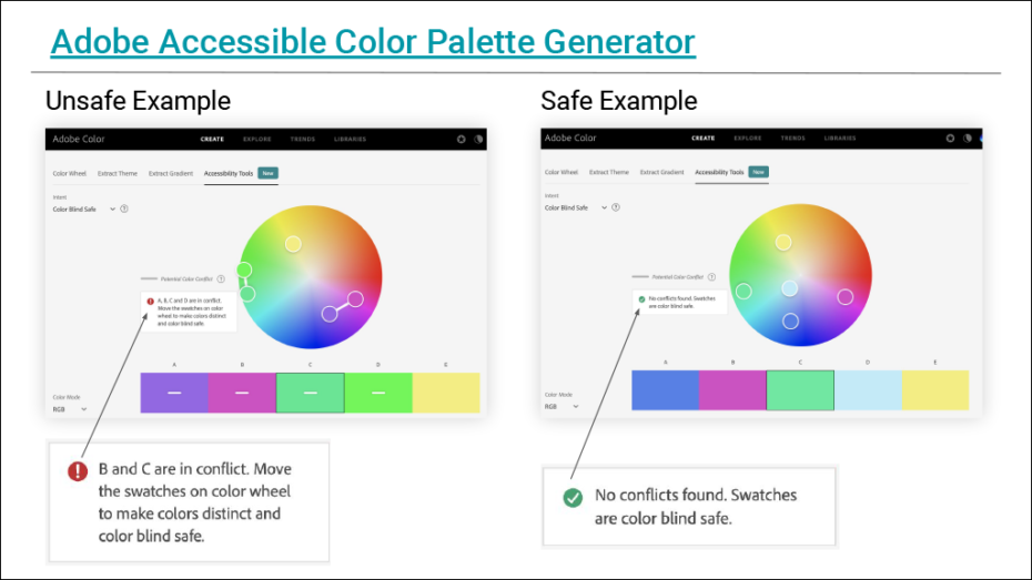
- use color contrast properly
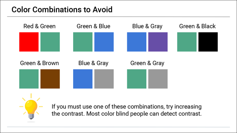
- avoid certain color combinations
- embrace minimalism