What does an EdTech company do when parents and teachers are demanding less screen time?
They hire a multidisciplinary designer (me!) to bridge the gap between digital and print curricula.
Despite our education system’s gradual shift toward online curricula, research continues to show that print materials offer distinct cognitive advantages—especially for deep, focused learning.
By carefully designing materials that work across platforms, we can provide students and teachers with the resources they need to succeed…in whatever format works best for them.
I’m helping Kiddom adapt curricula for multiple delivery systems, collaborating with my “digital-only” colleagues to identify, understand, and embrace the strengths and differences of print and digital media.
How is it working out? See for yourself.
Experience
What is Kiddom?
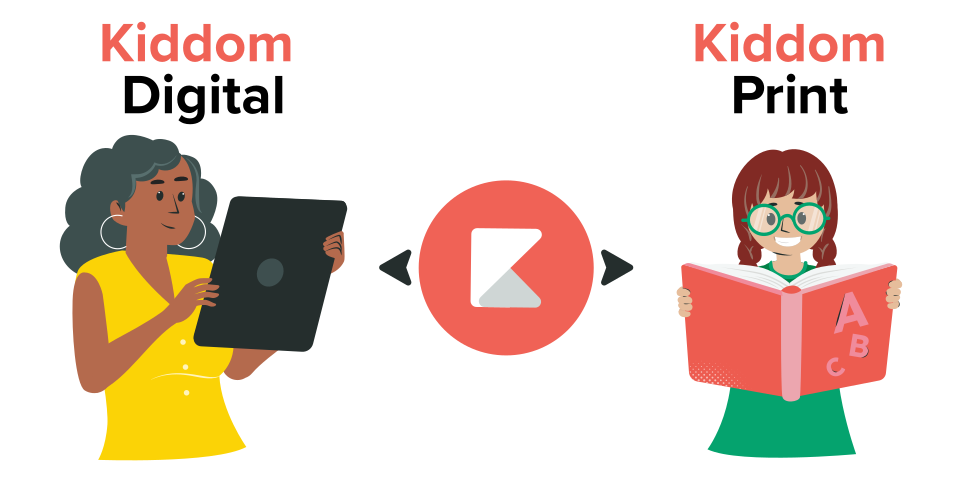
Kiddom is a digital learning environment that integrates proprietary technology and tools with K–12 curricula.
By adding features and functionality to expert curricula…known in the industry as High-Quality Instructional Materials (HQIM)…Kiddom makes it faster and easier for teachers to plan, teach, assess, and report.
Schools choose the Kiddom digital experience, print materials, or both to drive the continuous improvement of instructional decisions, school/district programming, and professional learning.
Curriculum
What are HQIM?
High-Quality Instructional Materials (HQIM) are educational resources that align closely with academic standards and are designed to be user friendly for both teachers and students, as defined by EdReports, a leading third-party curriculum reviewer. HQIM are vetted, comprehensive, evidence-based curricula verified for academic rigor.
While free and well-funded, HQIM often lack the tech features students and teachers expect. Kiddom’s digital enhancements (e.g., personalization, dynamic assignability, and AI assistants) make using HQIM faster and easier.



Methodology
Designing Curriculum
Education is evolving, and so must our approach to content development. Because I have more publishing experience than almost all of my colleagues, I found myself introducing pedagogical concepts that must be part of any platform—print or digital (such as Instructional Model, Scope and Sequence, Learning Path, Planning, Pacing, and Differentiation)—as well as the fundamentals of schema and automated print production.
As a platform-agnostic curriculum designer, my philosophy is simple:
I approach curriculum design as if I am the first student. I have to understand the instruction before I can design it. My methodology is sequential and not dissimilar to the design thinking approach embraced by product designers:
Analyze > Synthesize > Ideate > Development

Schema
What is Schema?
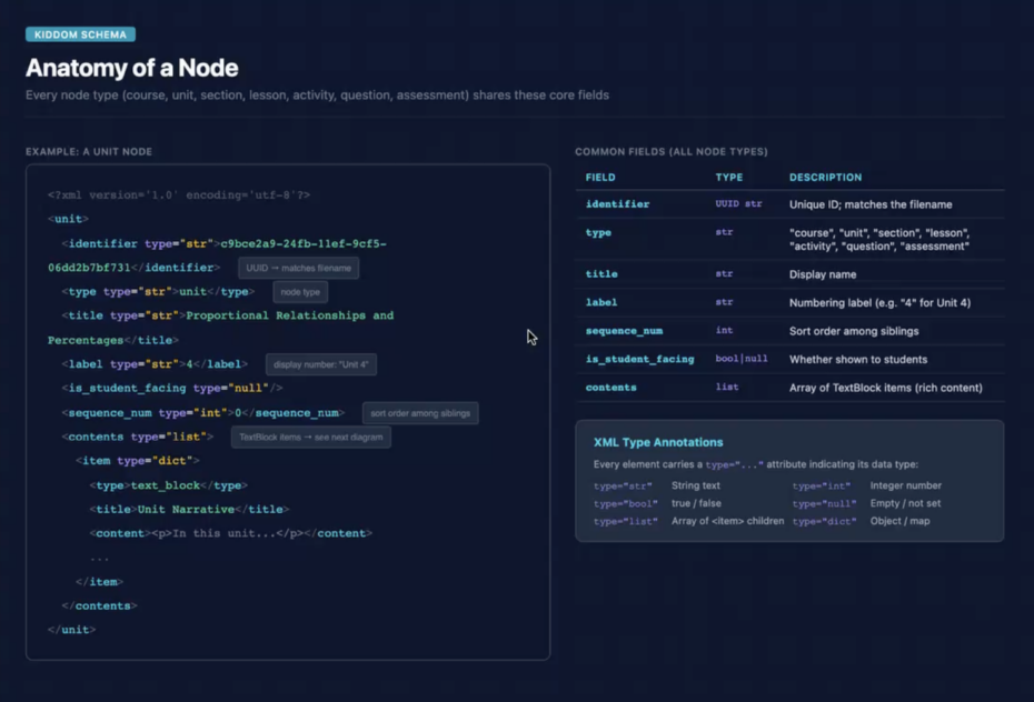
Schema for publishing involves a structured content model (often using XML or JSON) that defines the elements and rules for content to be automatically formatted and published across multiple channels.
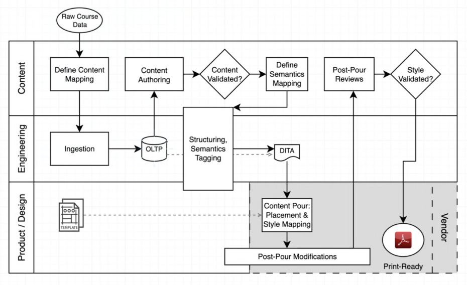
Schema is central to a single-source publishing workflow, which separates content from design to enable automation.
The content uploaded to the Kiddom platform was not being tagged with XML, as the content hub was designed solely for a digital workflow. In fact, many of my digital-only colleagues were unfamiliar with multichannel publishing, a content delivery method that distributes a single piece of source content to multiple formats for distribution on multiple channels. As one of the few team members with expertise in automated print publishing, I took on the role of educating colleagues and advocating for the implementation of Schema, alongside enterprise-level content and digital asset management systems.
Collaborating with the engineering team, I helped outline a workflow plan for a multichannel publishing approach. I also recommended that the company consult with automated publishing experts who could assist in defining and implementing a multichannel publishing system.
Analysis
Exploring Kiddom
I initiated the discovery phase by conducting interviews with colleagues. Through these discussions, I learned that the product team had prioritized the platform’s design over the enhancement of the ingested curriculum.
By reviewing the platform, slide decks, marketing collateral, and print books, I noticed recurring patterns, common themes, inconsistencies, and gaps across these different sources. Colleagues also provided UX research reports that contained detailed customer feedback and insights.
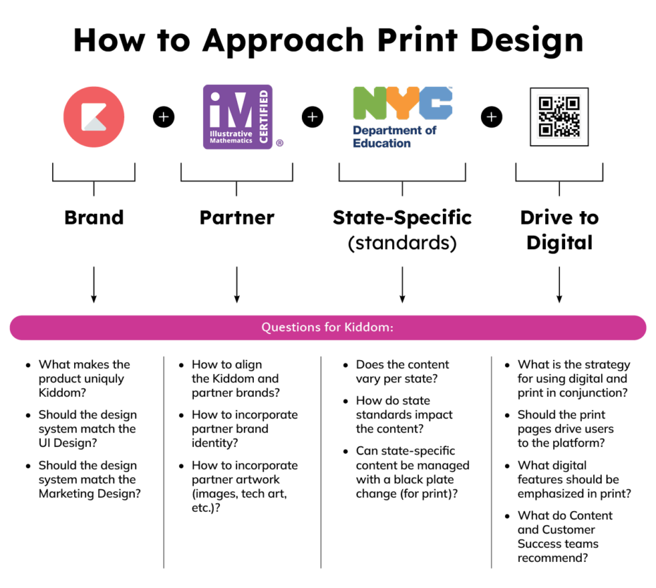
I grouped related findings and formulated questions about strategy, workflow, and tooling:
- how is curriculum ingested into Kiddom…and what happens next?
- how is curriculum modified to meet state standards?
- how is curriculum enhanced by digital tools?
- what is the process for transforming curriculum into a printed book?
- is there alignment between the digital and print components?
- is there a strategy for using digital and print in conjunction?
Synthesis
Putting it All Together
I was asked to work with Kiddom Illustrative Mathematics v.360 K–12 curriculum. Through a comprehensive analysis of the curriculum, I identified instructional patterns that would benefit from refinement and enhanced visual representation. My goal was to boost engagement, accessibility, and brand alignment. In line with feedback from nearly every curriculum I have developed, educators consistently highlighted the need for a reduced page count.
I organized my findings into two categories:
Design Strategy
- separate core instruction from discussion supports and facilitation for teachers
- use grade-level appropriate font sizes for student-facing pages
- introduce navigation and pacing into the print experience for teacher and students
- scannable instructional elements and connections within a common page architecture
Production Strategy
- organize the content into modular, reusable components with clear semantics and metadata for production
- define consistent styling and formatting requirements
- identify “dependency content” that could be shared between teacher and student books
- insert the annotated answers at point-of-use to reduce page count
- collaborate with engineering to build a schema of content types for Kiddom to begin automating production
- create documentation for sharing knowledge, ensuring quality, and training new staff
Noticing that content was shared between the teacher and student materials, I proposed a more efficient production solution:
- placing the Annotated Answers (annos) on a separate layer within the Student Workbook InDesign files
- importing the Student Workbook InDesign files directly into the Teacher Edition InDesign files as reduces
This approach enabled automatic updates for all linked documents, which ultimately saved time during production. It also established a single source of truth, considerably decreasing the chance of errors by removing the necessity to typeset and proofread the content in two different files.
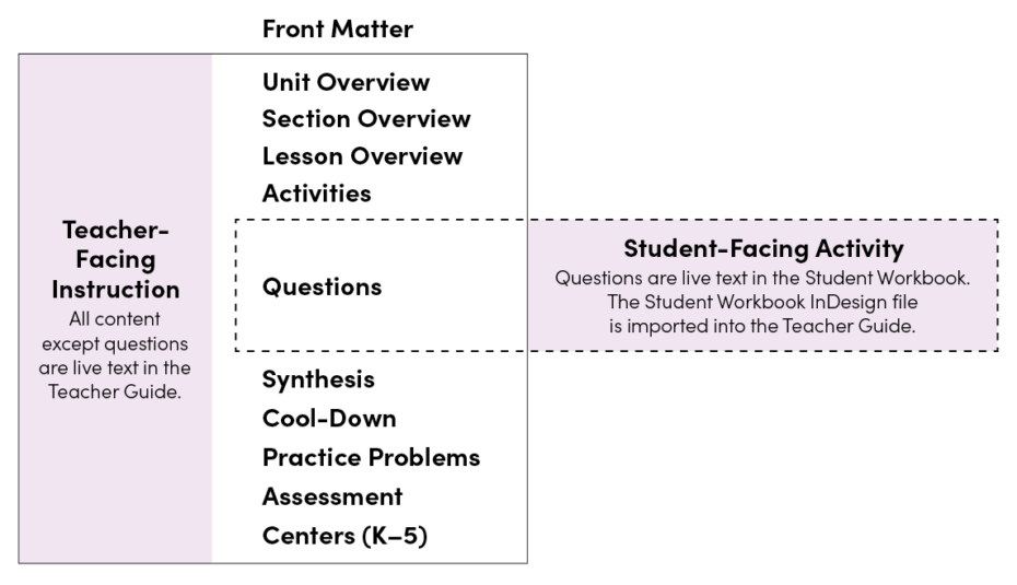
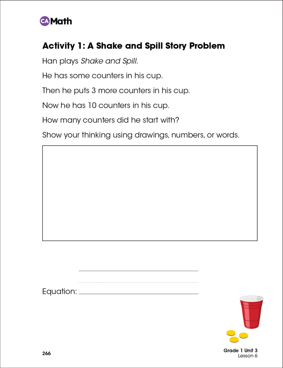
In the original printed books, the Annotated Answers (annos) were positioned below the Student Activity redux, resulting in increased page count. Sometimes, the annos and their corresponding Student Activity were positioned on different pages, making it challenging for teachers to follow and understand the instruction.
By placing the annos in context within the Student Activity, teachers receive instructional support at point-of-use and overall page count is reduced.
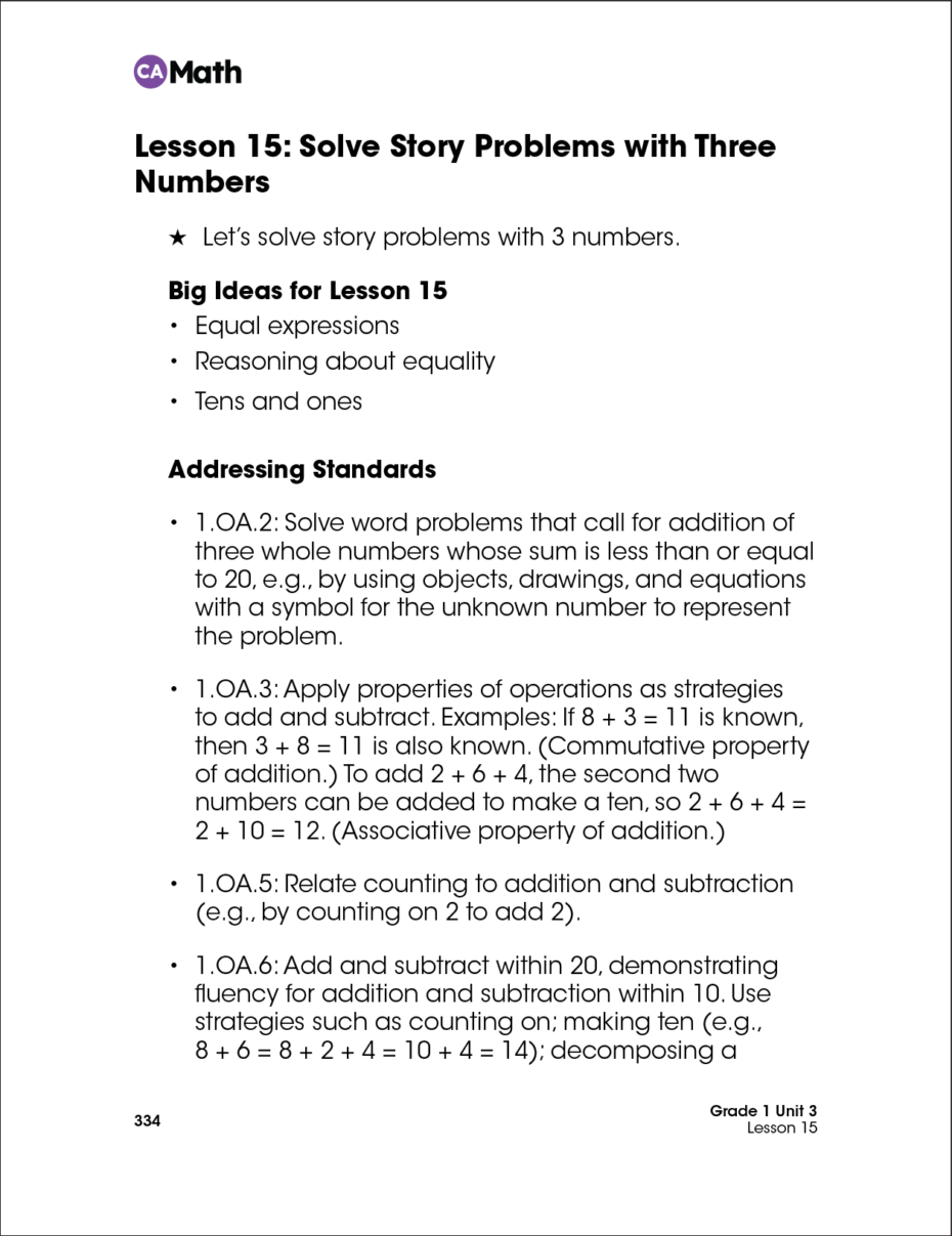
A Student Activity (shown at left below) is imported into the Teacher Edition (shown at right below) at a reduced size and labeled as a Student-Facing Task.
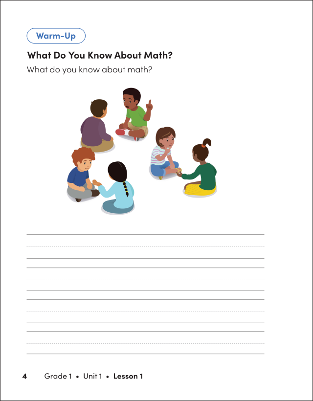
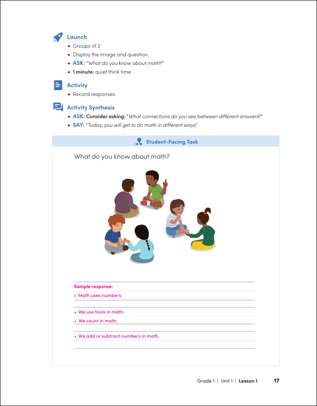
After learning that Student-Facing Activities were comprised of a series of questions identified by type, I designed a distinct structure and format for each type. I also recommended sizing all student fillable sections to fit the expected length of their responses.
Teacher feedback highlighting the need for visual consistency between the digital and print versions and drove these improvements.
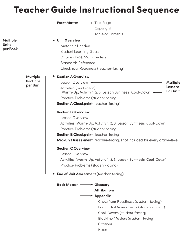
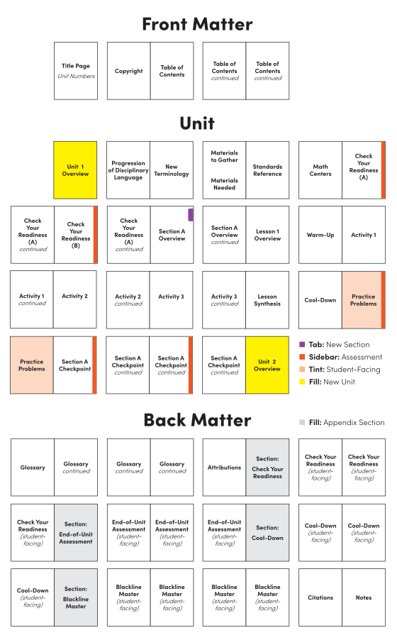
I identified the Instructional Routine and planned the Teacher Guide’s page sequence and navigation. I also identified the unique text types to tag and map to schema for an automated publishing workflow.
Ideation
Defining the Design System
When comparing the digital platform to the existing print product, I observed that in both:
- the text mainly appeared in black, with only minor differences in font size among different types of text
- the layouts lacked the usual design elements commonly found in curriculum materials
- most of the content was formatted in a similar way, making navigation and understanding somewhat difficult
This also led to questions about whether and how the two mediums were intended to complement each other.
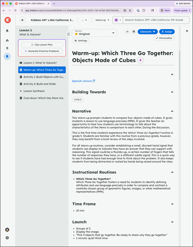
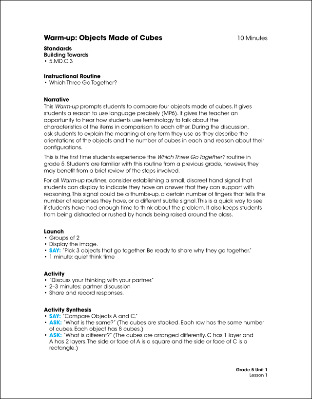
I created visual and structural cohesion across both digital and print formats by incorporating:
- shared color systems
- aligned layouts
- visible instructional connections
- shared iconography
- common page architecture
- strengthen navigation and way finding
- integrate cross-references
First, I identified existing graphic elements from:
- the book cover design: grade-level color palette and background patterns
- the user interface (UI): navigational iconography
- marketing: brand color palettes, typography, iconography, and other visual elements
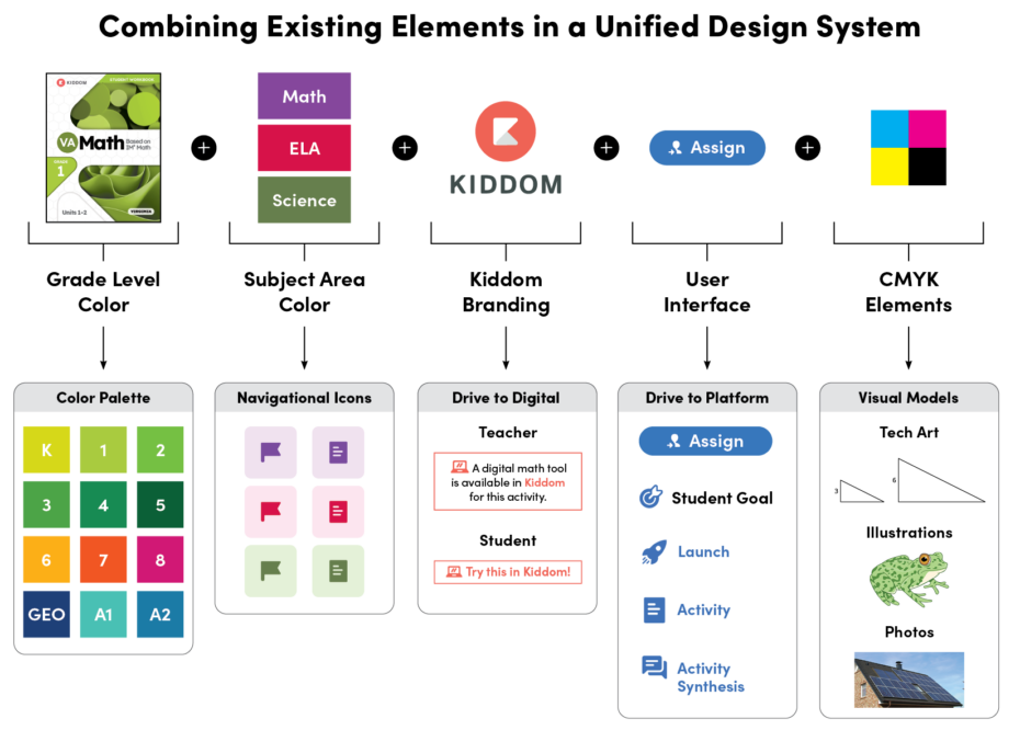
I designed unique, replicable components customized for each content type, ensuring their seamless integration across both digital and print platforms. Objectives included:
- establishing a clear, consistent, and intuitive navigation framework
- engaging learners by highlighting and differentiating instructional elements
- enhancing legibility and reducing cognitive overload
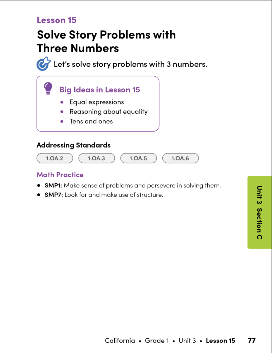
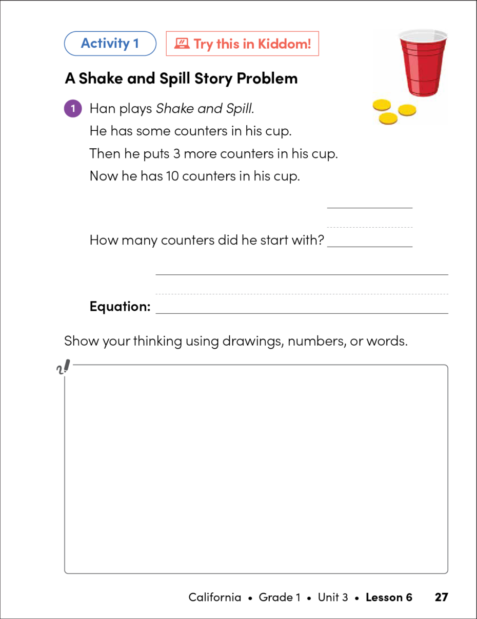
Design decisions for the Student Workbook included:
- introducing grade-level, age-appropriate typography to align with cognitive development
- adding tabbed and sidebar navigation to assist with way-finding
- sizing all fillable sections to fit the expected length of student responses
- making a Kiddom connection for activities with corresponding digital tools
Student Workbook
Design System Components
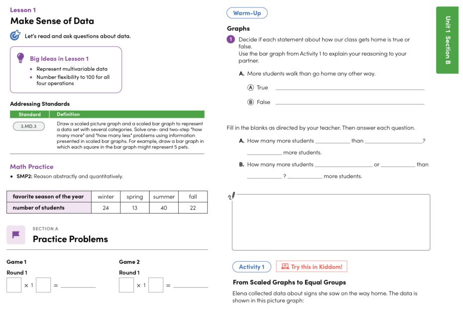
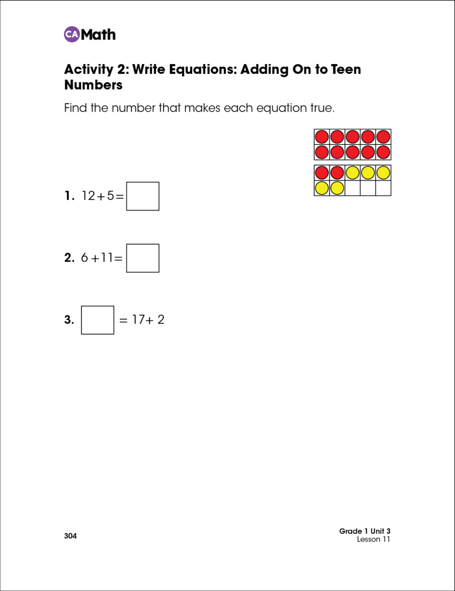
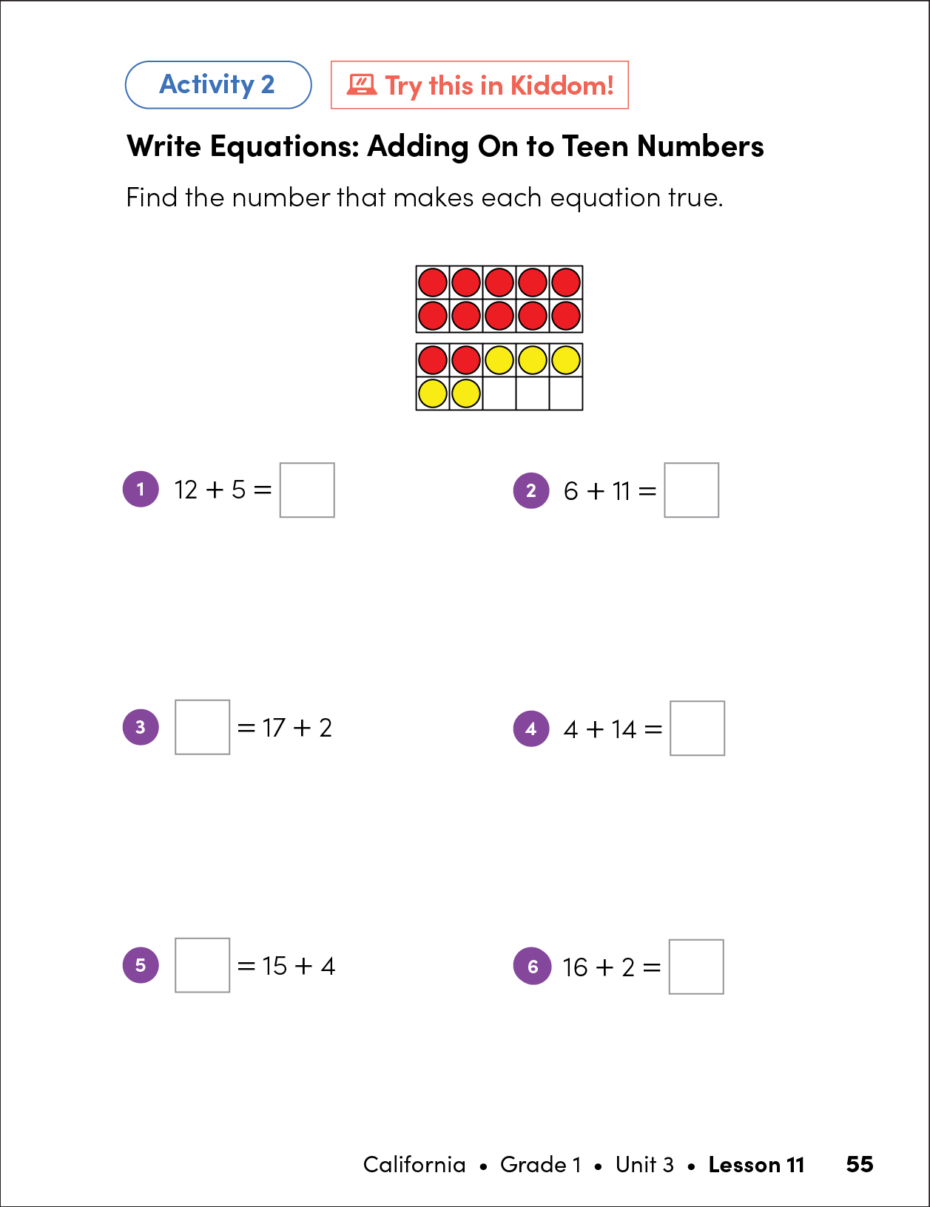
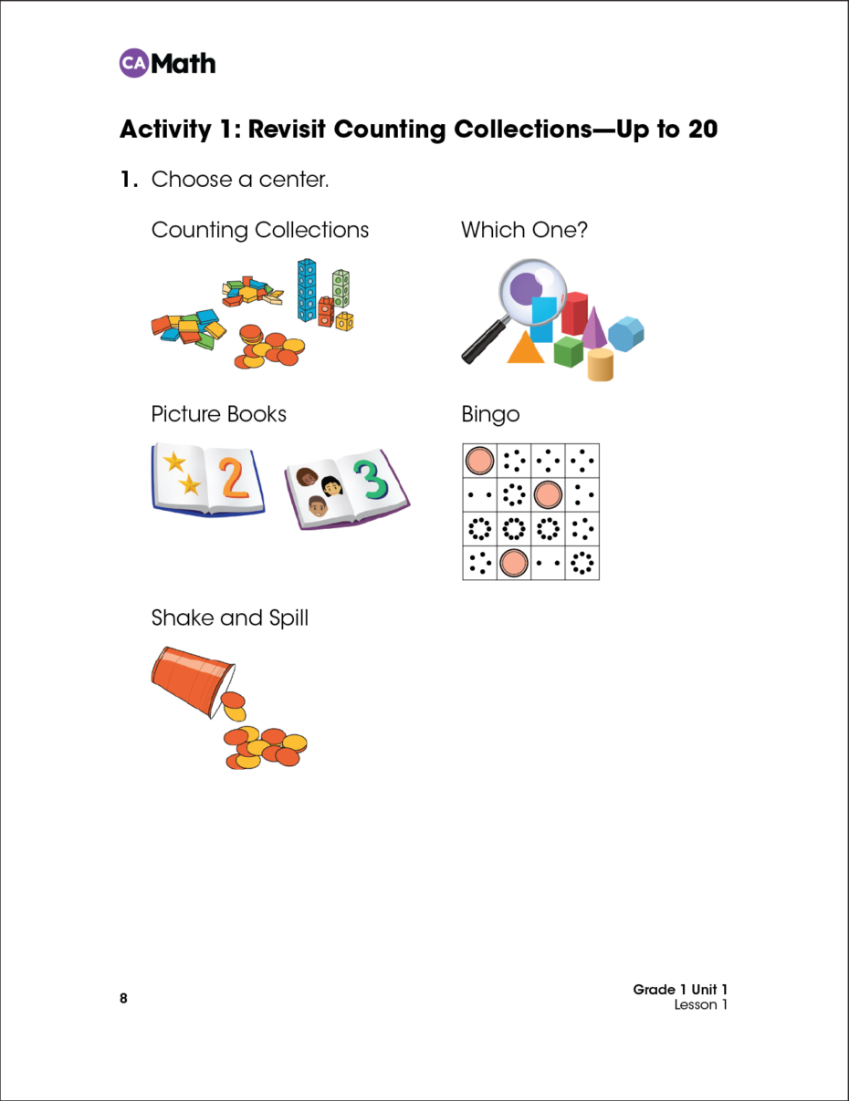
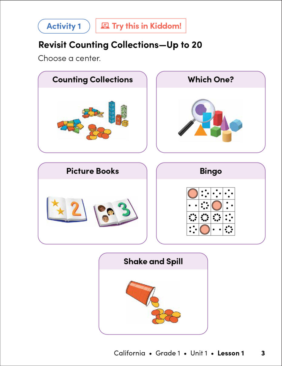
The sample pages below demonstrate the transformation in print layout before and after the implementation of the design system. On the left is the Kiddom print before the design system was applied. On the right is the Kiddom print after the design system was applied. Notice how each page type is now more structured, vibrant, and engaging for students.
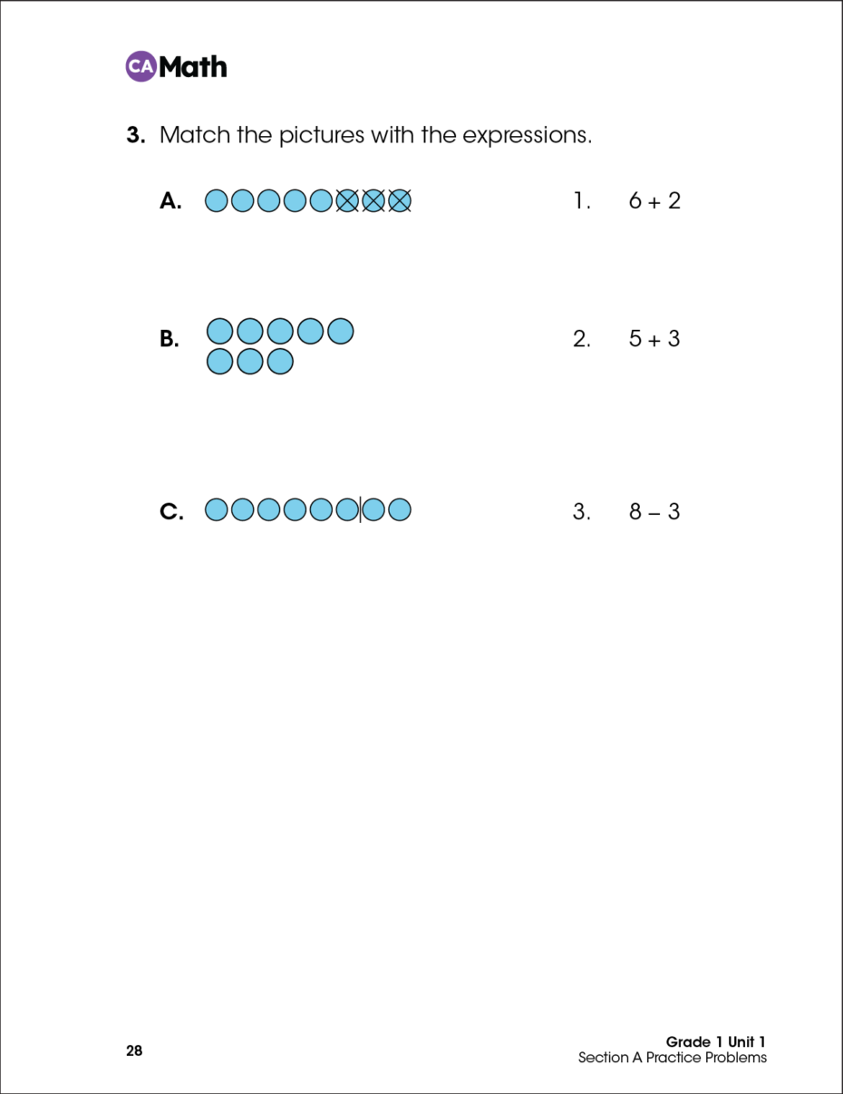
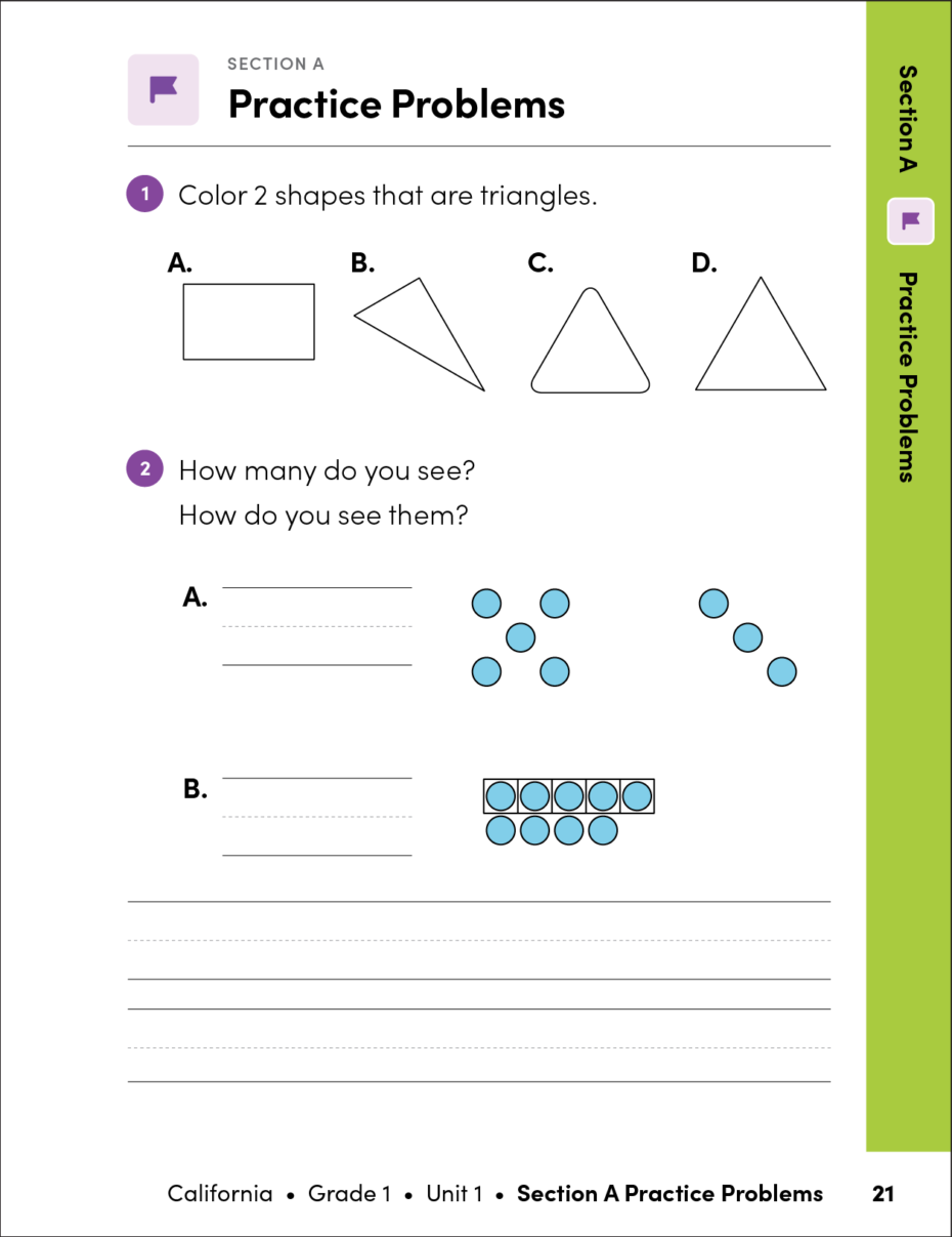
Design decisions for the Teacher Edition included:
- reordering content hierarchy to telegraph scope and sequence
- including standards alignment per section and per lesson to support state curriculum expectations
- highlighting the instructional routine with icons from the platform UI
- embedding supports for multilingual learners and students with cognitive disabilities
- placing annotated answers in context to reduce page count
- differentiating assessment pages from instruction with sidebar navigation
Teacher Edition
Design System Components
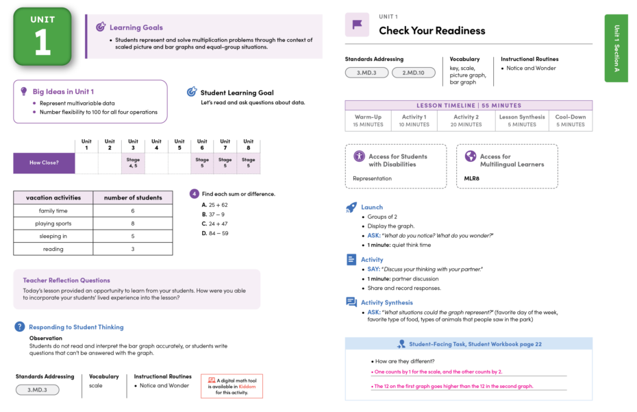
The modifications to the Teacher Edition were significant. To accurately assess the impact of the design system implementation on the print product, let’s compare a unit of instruction from the original version with the updated version.
Kiddom Teacher Guide BEFORE Design System Implementation
Kiddom Teacher Guide AFTER Design System Implementation
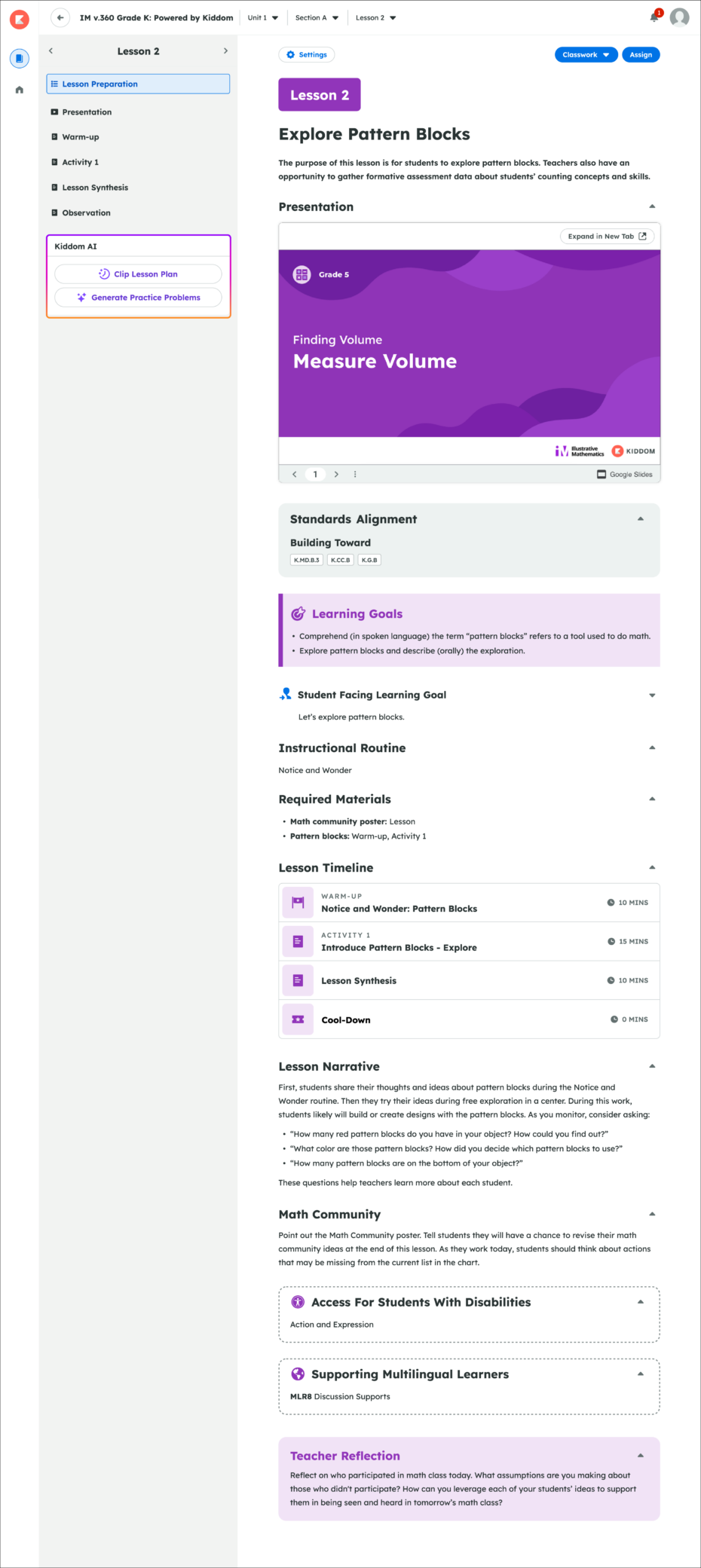
The structural cohesion of the new design system was easily applied to the same curriculum within the Kiddom platform.
Development
Implementing the Design System
Prototypes were converted into structured templates, organized by grade level, component, and page type to be utilized by external production vendors.
A dedicated Wiki was created to define and share style rules and support team members in accurately and consistently implementing the design system.
Comprehensive style guides defined global design rules, file naming conventions, best practices, and guidelines for mathematical typesetting.